 > COMPANY > 브로슈어 / CI
브로슈어 / CI
- 브로슈어
- CI


01
로고의 의미
(Meaning of logo))
새롭게 태어난다는 의미에서 NEW의 N자를 추상화시켰으며, 또한 잘 뻗은 고속도로가 연상되듯 새롭게 질주해나간다는 의미가 내포되어 있다.
it abstracted the N of NEW in the sense of being born anew, and also implies a new dash as if it were a good stretch of highway.
02
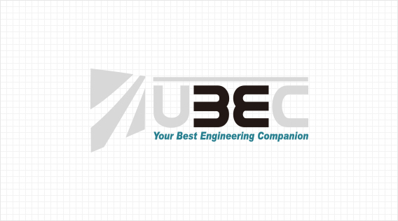
사명
(Mission)
B자와 E자를 강조하여 눈에 띄는 효과와 전체적으로 대칭이 되는 느낌이 들도록 하였다.
UBEC의 아래에 풀네임을 명기하여 사명의 정확한 뜻은 물론 전체적인 조형미를 살렸다.
Highlighting the letters B and E gives a noticeable effect and a feeling of overall symmetry.
Under the UBEC, the full name was specified to save the exact meaning of the mission as well
as the overall beauty of the sculpture.
03
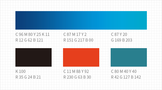
색상
(Color)
우리나라 전통의 색깔인 빨강, 파랑, 검정을 기본으로 하였으며, 로고는 진한 파랑으로 하여안정감을 주었으며,동시에 그라데이션 효과를 사용하여 입체감을 주었다.
It was based on red, blue, and black, which are the traditional colors of Korea, and the logo had a sense of stability with deep blue, and at the same time, it used gradation effect to give a sense of three-dimensional effect.